Improving online donation journeys to enhance user experience and increase revenue
Charity: Shelter
Duration: 9 months contract
OUTCOME
A comprehensive knowledge-base and action-orientated report of insights, as a solid foundation for designing new online donation journeys that will enhance the user experience, improve conversion, and increase revenue.
THE CONTEXT
Shelter is a national charity that tackles homelessness and poor housing in the UK. The charity identified an opportunity to improve the usability and accessibility of online donation journeys. It was anticipated that this would enhance the user experience, and so increase revenue to support the charity’s work to end the housing emergency.
The charity launched a strategic project to transform the way they design, manage, and continually improve online donation journeys. I was appointed on a fixed-term contract to lead UX activity for the project.
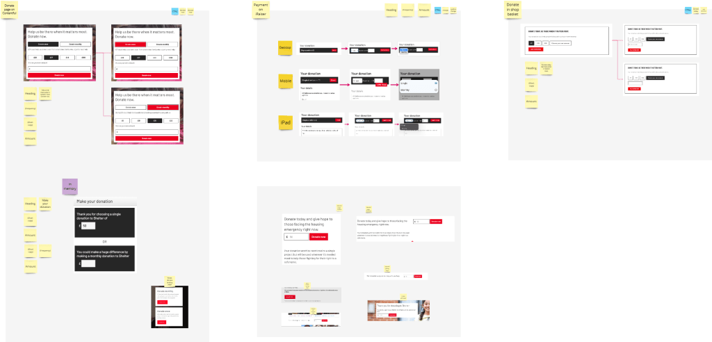
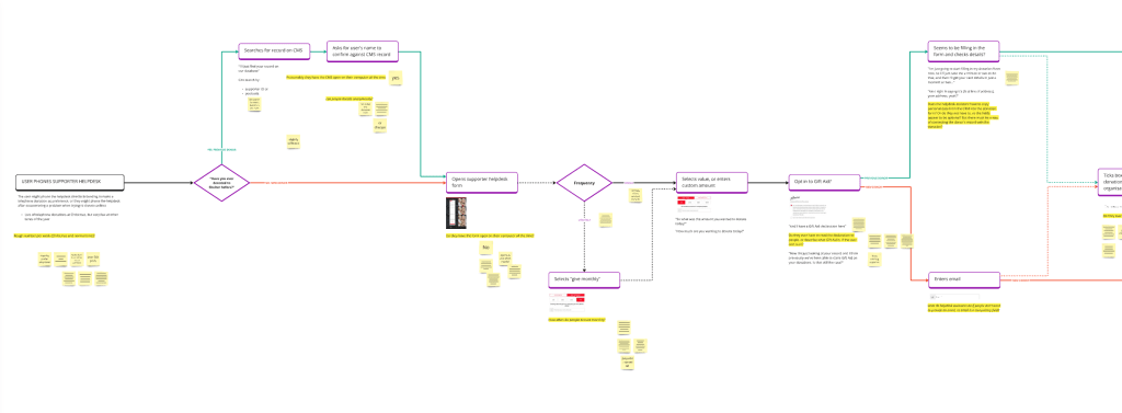
(Please note that many of the visuals on this page are intentionally unreadable, as this is a live project)

THE CHALLENGE
Shelter offers lots of different ways for people to donate. The most popular way to donate is on the Shelter website. But some people find the online donation experience to be long, arduous, or unsuited to their needs, so resulting in:
- negative experiences for potential donors;
- reduced conversion rates;
- decreased income from donations.
Also, the technical development of the donation journeys, and the backstage processes for managing donations, can be high-effort and time-consuming.

THE BRIEF
Work at pace to lead UX activity to evaluate the current online donation experience, identify ways of designing new and improved donation journeys that support donor acquisition and retention, and use these insights to inform concept design and visual design for new online donation experiences.
THE SOLUTION
Working collaboratively with colleagues and stakeholders, I quickly formed a comprehensive understanding of online donations at Shelter: how things work, what is going well, what needs to be improved, and how it could be improved.
BUILDING A KNOWLEDGE BASE
I created a knowledge-base of actionable insights by producing and presenting a comprehensive (100+ page) written report, covering a breadth of topics, including: information architecture; visual design; content design; external compliance; trust and security; anonymity and personal data; ethical and responsible design; inclusive design and trauma-informed design.

DESIGN ARTEFACTS
I produced early stage design concepts, and a set of high-quality design artefacts that serve as reference points for designing new solutions:
- a user story map, documenting user needs and business needs for each donation stage;
- a set of 10 user archetypes, segmented by attitudinal and situational factors;
- journey flows for all online donation journeys;
- user journey maps.
This knowledge-base will prove to be invaluable as we are now developing further our design concepts for the new online donation experiences.
ACTIONABLE REPORTING
I compiled a comprehensive report to communicate the insights and recommendations, so that design work could continue after my fixed-term contract had come to an end.

ANTICIPATED IMPACT
It is anticipated that this project will:
Significantly improve the user experience, with the knock-on effect of…
Increasing conversion, and so increasing revenue.
Improve the efficiency of backstage processes to make it quicker and easier to design, build, and continuously improve online donation experiences.
Ultimately, all these impacts should result in increased revenue, enabling Shelter to continue its work to end the housing emergency.

MY DESIGN PROCESS
Mapping the donation landscape
I started by carrying out desk-based research to map Shelter’s donation landscape, identifying different donation journeys and scenarios, and the connections between them.
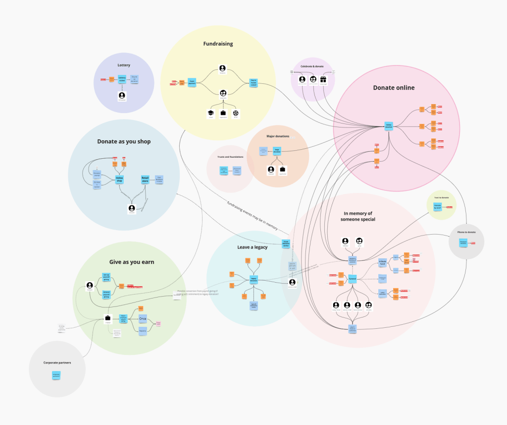
I conducted cognitive walkthroughs to step through and visualise key user journeys. I tested with different devices and different journey starting points – including from social media ads, email campaigns, and search engines – taking in the landing pages, donation forms, confirmation screens, and emails.
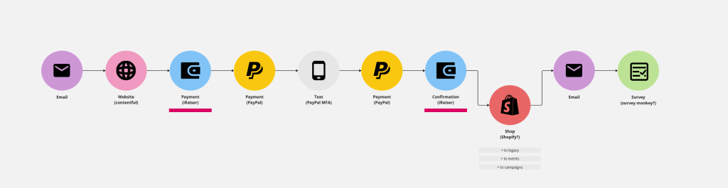
This helped me become familiar with the different stages and steps in the donation journeys, the format and content of the online donation forms, the visual and content design, technical issues, accessibility issues, and user experience issues. It also helped me identify intentional and unintentional, useful and problematic, variations between donation journeys.
I documented and catalogued pain-points, challenges and opportunities for each stage in the donation journeys.

Analysing user behaviour
While the cognitive walkthroughs gave me an understanding of the user interface and the act of donating, it could not help me understand how other people experience online donations.
I wanted to understand real user behaviour (rather than staged scenarios in user testing), so I used HotJar to gain insights on how people interacted with the online donation journeys. I analysed heatmaps, clickmaps, and screen recordings.

The latter, in particular, were extremely helpful for understanding how people move through (or leave) donation journeys, how they complete donation forms, where they encounter errors, and how they interact with different screens and information.

This was especially useful for developing actionable insights relating to personal data, Gift Aid opt-ins, and communications preferences, as well as how people responded to mandatory fields and errors.
Knowledge-sharing
I built strong relationships with stakeholders across the whole organisation, so that I could learn about how different teams and individuals relate to online donation journeys. This included colleagues in Individual Giving, Supporter Acquisition, Legacy, Philanthropy, Data, Finance, Gift Aid, and the Supporter Helpdesk.
I worked with colleagues to iteratively create user flows, capturing backstage processes, user needs, business needs, pain points, and suggestions for improving donation journeys.
As I was leading UX activity for the project, I also worked closely with a User Researcher and Senior UX Designer, who were supporting later stages of the project.

I designed workshops and collaborative working sessions for us to pool our knowledge, document assumptions, collectively explore organisational data and reports, and work together to identify and prioritise key questions for user research.

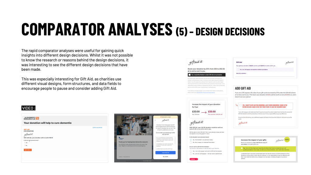
Comparator analyses
I carried out comparator analyses to gain quick insights on alternative ways of designing online donation journeys.

In a short space of time, I discovered a lot about different options and approaches to design decisions, such as:
Information architecture: how might we structure and order donation journeys most effectively?
Content: how might we carefully craft copy to prevent attrition and increase conversion?

Responsible design: how might we use design nudges ethically and responsibly to help people consider options that they might otherwise overlook?

Visual design: how might we use colour to create friction and draw attention to important decision points?
Customisation: how might we design donation journeys that are appropriate to the user, but without creating a multiplicity of niche journeys?
User research plan
I created a User Research Plan to set out the strategy for user research, including research goals, questions, methods, operations, and informed consent. I shared the plan with key stakeholders so that they had the opportunity to ask questions or have an input.
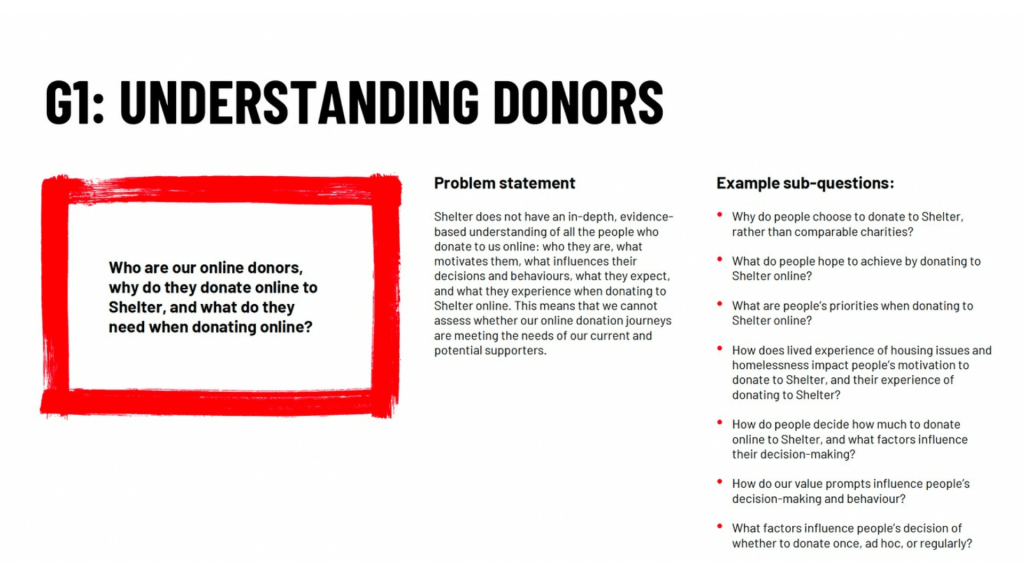
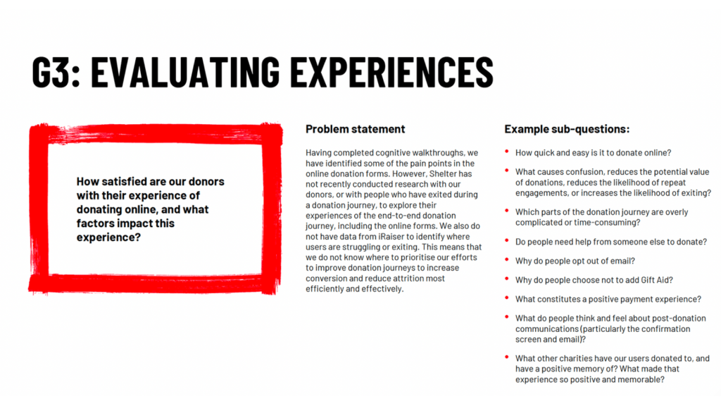
In the User Research Plan, I set out four research goals, which aligned with the wider project’s objectives and metrics:


Surveys
I designed and launched an online survey for people who had recently donated to Shelter. The survey was designed to be both a research tool and a recruitment tool for inviting specific individuals to interview.
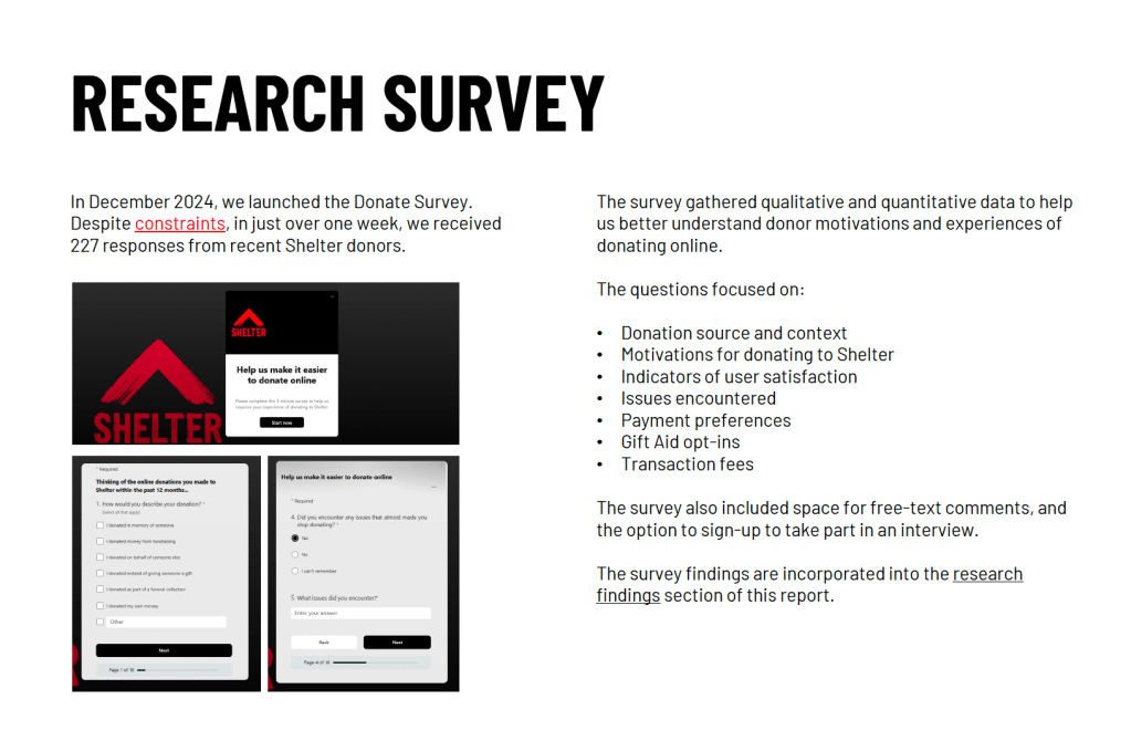
Despite significant constraints in contacting the target group, I received 227 responses, providing useful qualitative and quantitative data to help me better understand donors’ motivations and experiences of donating online.
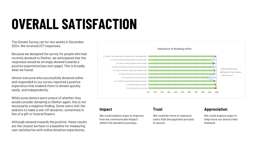
I analysed the data in Excel and through affinity mapping. The results were insightful – some were unexpected and incredibly helpful – and I used them to refine the lines of inquiry for interviews.
I also produced two pop-up Exit Surveys in HotJar to gather information from people who left the donation journey before completing their donation.

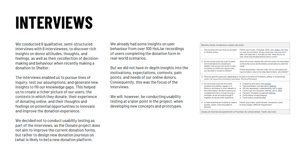
Interviews
Significant constraints in recruiting interviewees meant that I was able to interview 8 recent donors, rather than the 16-24 I had planned to interview.
But the in-depth, semi-structured interviews were extremely helpful for painting a richer picture of Shelter’s donors, the contexts in which they donate, their experience of donating online, and their thoughts and feelings on potential opportunities to innovate and improve the donation experience.
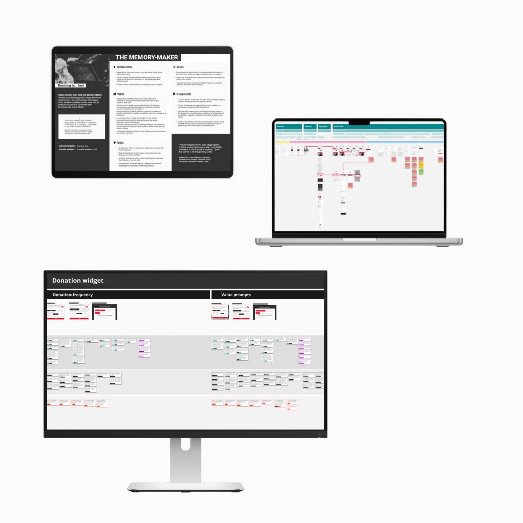
Design artefacts
I created a set of high-quality design artefacts to capture design requirements, and serve as reference points for concept design and future phases of the project.
While the artefacts all started as pen-and-paper sketches, I refined these throughout the project to become more useful.
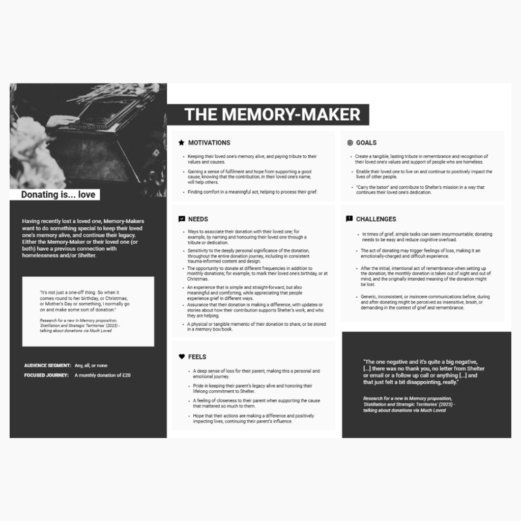
I worked with colleagues to draft proto-personas, which I then developed into a set of 10 evidence-based user archetypes. These are live documents that will continue to evolve throughout the project and beyond.
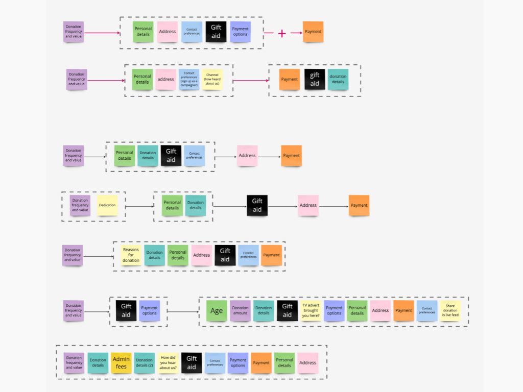
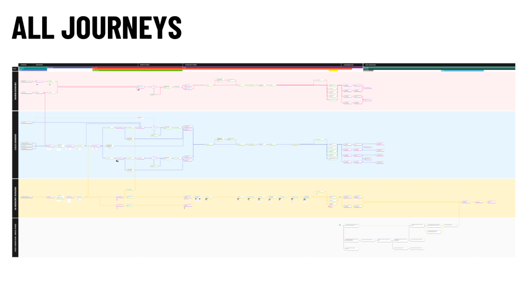
I created various maps, including user journey maps, journey flows, and servce blueprints, to visualise the donation journeys, as well as pain-points and opportunities. The process of creating these artefacts has been as valuable as the products, as it has brought clarity to the complexity of multiple interlinked but different donation journeys.

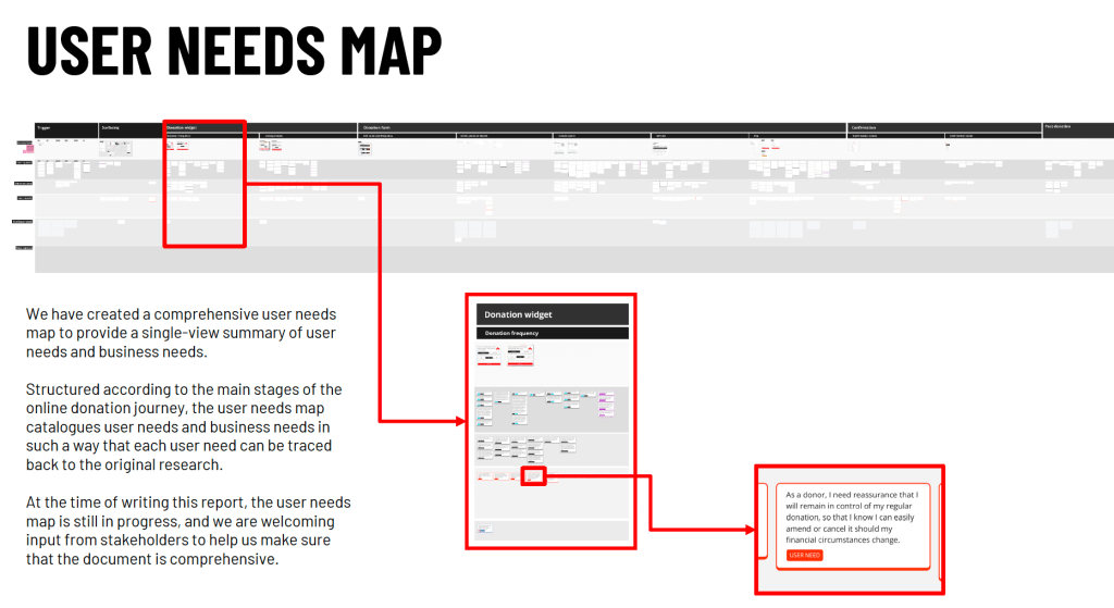
One of the most important design artefacts I created is the user needs map, which provides a single-view summary of user needs and business needs. Structured according to the main stages of the online donation journey, the user needs map catalogues user needs and business needs in such a way that each requirement can be traced back to the original research.
Example: In Memory donations
Shelter has lots of different online donation journeys. Many of these journeys are quite similar. But the In Memory donation journey is different.
This is partly (but not entirely) intentional, to meet the specific needs of In Memory donors; for example, to include a space for the donor to leave a message or ‘tribute’ when donating, or to receive a physical card as a memento after donating.
But currently there are challenges with In Memory donations, as it is easy for an In Memory donor to inadvertently leave the In Memory journey and enter the main donation journey, which is not suited to their needs. But, because these donors are “hidden”, we do not know the size of this user group.
We also know that donating In Memory is often a deeply meaningful act. It is not just a transactional task. And it comes at a time of strong emotion and stress. The donation journey needs to reflect this, from start to finish, and onwards to appropriate welcome journeys.
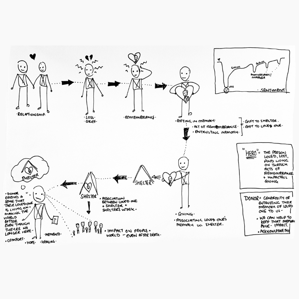
We also know that emotional strain – such as feelings of loss and grief – can hinder our ability to take in information, follow instructions, and make decisions. The donation journey needs to be clear and simple, helping users at key decision points, and not putting them under additional pressure or strain.
This project has made us more aware of how the current In Memory donation journeys could be improved to better meet users’ needs and business needs.

This has directly informed our current work on concept design, as we are exploring ways of making sure that In Memory donors are guided and supported, and do not inadvertently get lost in journeys that are not tailored to their needs.

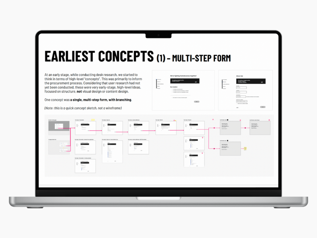
Concept design
At an early stage, I started to explore high-level design “concepts”. This was partly to inform the procurement process, which was taking place concurrently.
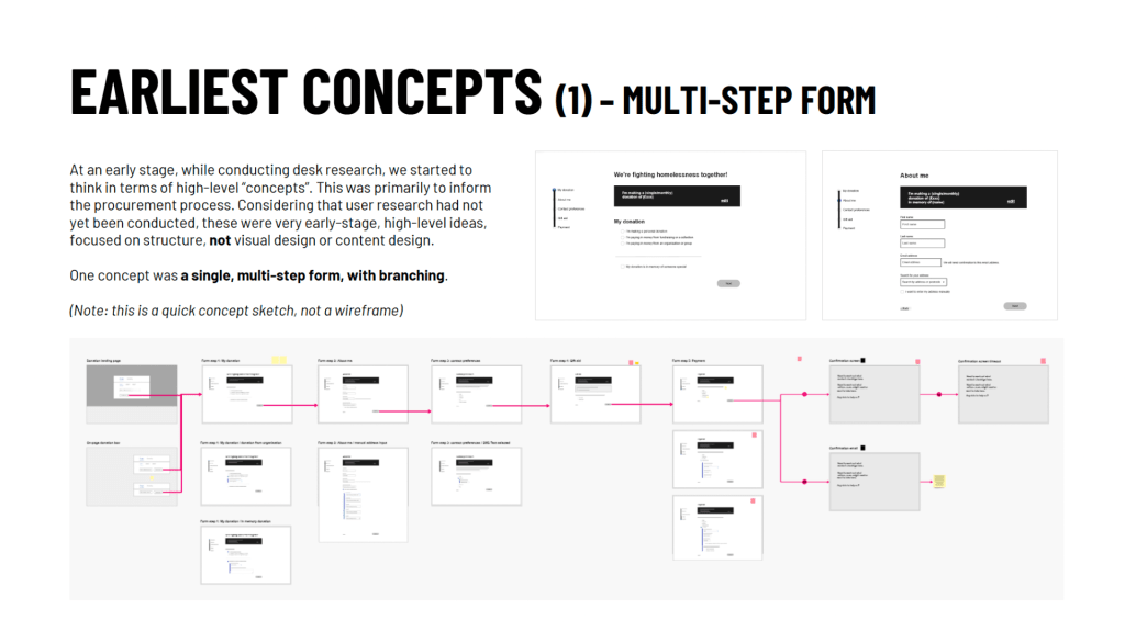


Considering that user research had not yet been conducted, these were very early-stage, high-level ideas, focused on structure, not visual design or content design.
But we will be developing these concepts, and variations of them, further.
Reporting
I documented all the findings of the desk-based research, user research, and early stage concept design in a comprehensive 100+ page written report.
I presented a summary of the findings to a large group of diverse stakeholders and colleagues at Shelter, and I received excellent feedback.
We are now in the concept design phase of the project, where we are working collaboratively with stakeholders to design the new online donation journeys.