Connecting refugees and asylum seekers with employability support
Charity: Bridges Programmes
Via: Scottish Tech Army
OUTCOME
I designed a new visual brand and website to transform the charity’s digital presence, reach, and growth.

CONTEXT
Bridges Programmes is a charity that helps refugees and asylum seekers find meaningful work in Scotland. They need a strong digital presence to:
- reach refugees and asylum seekers who need support;
- nurture and grow their network of partners and funders.
The challenge
The website was old and hard to navigate. Visuals were dated. Content was not accessible, and no longer relevant. Links were broken. The existing brand and website didn’t represent the charity, its services, or its impact.

THE BRIEF
Design a new brand and website to capture and convey the essence of the charity.
Work independently, in collaboration with the charity’s leadership, and connecting with the charity’s work to refresh its strategy, vision, and values.
THE SOLUTION
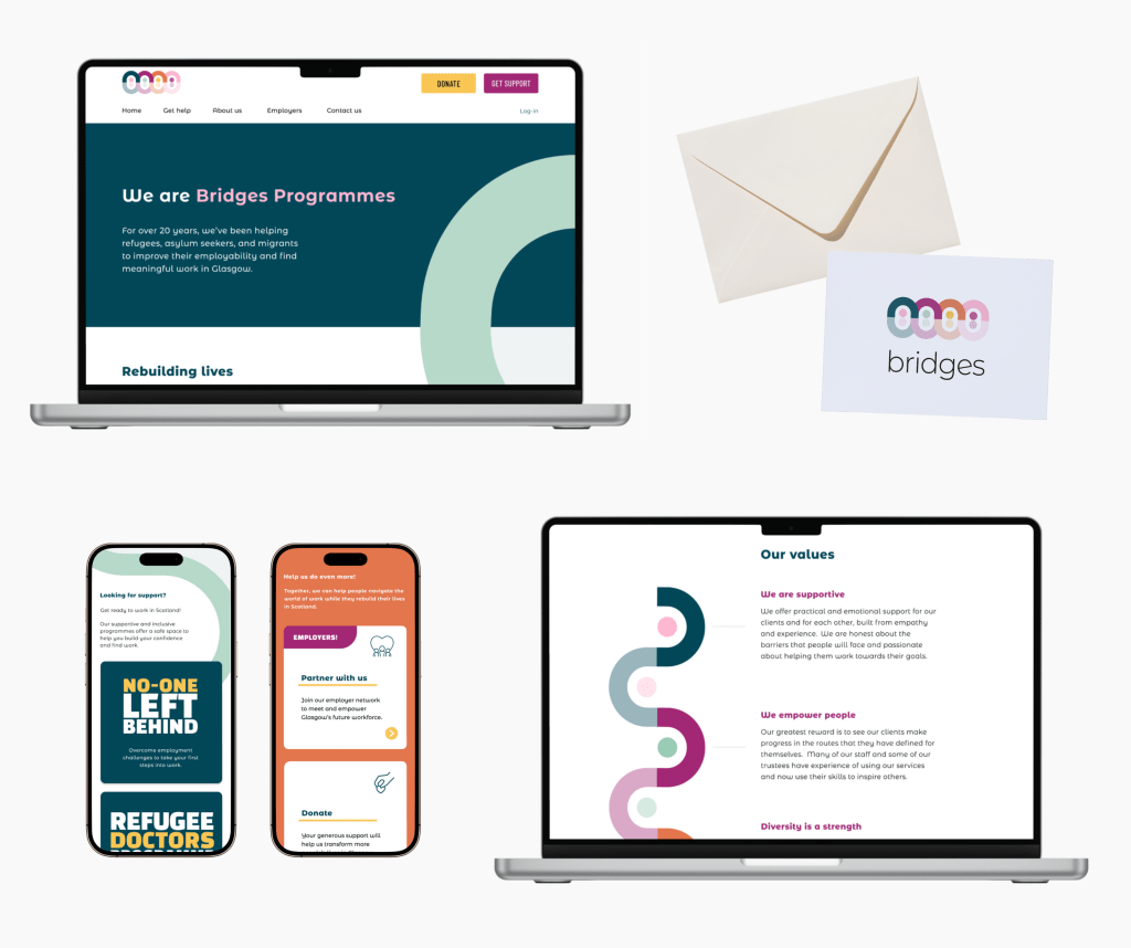
A fresh, eye-catching, and memorable brand that visualises the charity’s values of diversity, connection, empowerment, and respect.
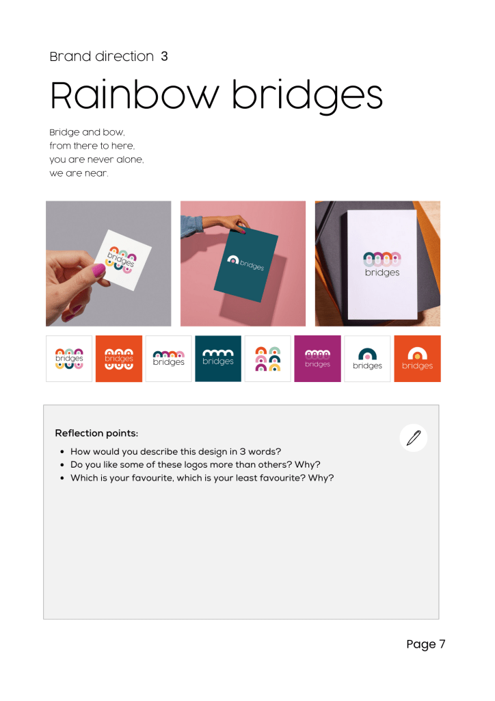
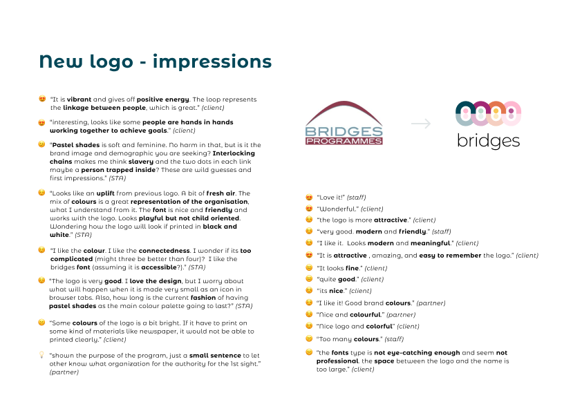
The “rainbow bridges” logo alludes to the charity’s regional roots in Glasgow: a city of bridges.
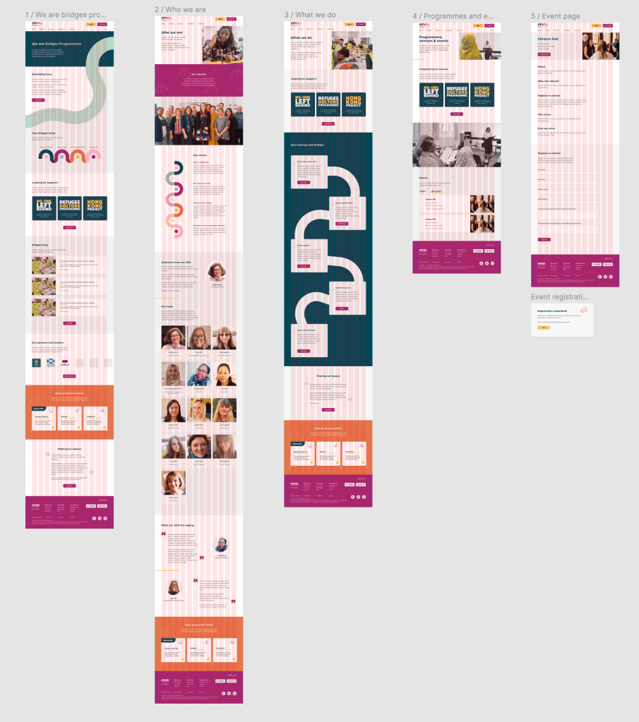
I designed an engaging and accessible new website to transform Bridges Programmes’ digital presence, making it easier for refugees to access support, and for the charity to grow its network of employers, funders, and supporters.


INTUITIVE USER JOURNEYS
…help people to find information and advice quickly and easily.
PLAIN ENGLISH COPY
…increases readability for people whose first language is not English.
CREATIVE CONTENT DESIGN
…reduces reliance on the written word, and improves understanding.
MY DESIGN PROCESS
Discovery
I met with the CEO to learn about the charity, its challenges and ambitions.
I captured this information in a presentation, and played back the presentation to the charity to ensure that I had fully understood the charity’s history and vision.

I mapped the old website to identify features, user journeys, and pain points.
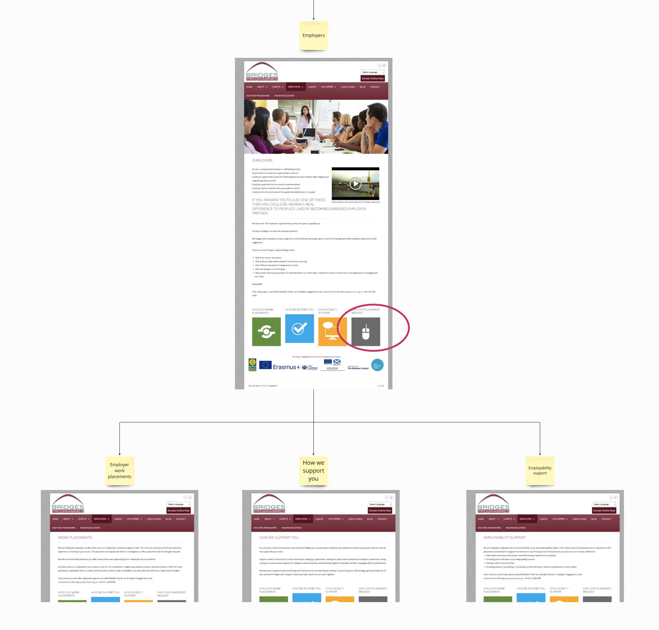
I sketched different options for the new information architecture. I created a digital sketch of the navigation menus to make the site map seem less abstract to the charity.
I researched the charity’s users, reading excellent books about lived experience, such as Asylum Speakers. And I reviewed websites and reports from other refugee charities in the UK.
Brand design
I sketched new brand concepts at a very early stage in the project.
I quickly developed these into a large number of ‘digital sketches’ that I explored in conversation with the charity to get identify which design directions best represented their vision and values.
Together, we selected a shortlist of design elements, which I developed into five directions for the brand design.

I wanted to consult all staff at the charity, so I created and shared a workshop pack with the brand designs, and prompts for people to reflect on independently.
Then I facilitated an all-staff workshop, giving space for different opinions to be shared and discussed.
There was a clear consensus on the design that resonated most with people in the room.
I refined the chosen design, and worked with the charity to explore various options for typography. The final brand designs were received and approved by the Board of Trustees, with excellent feedback.
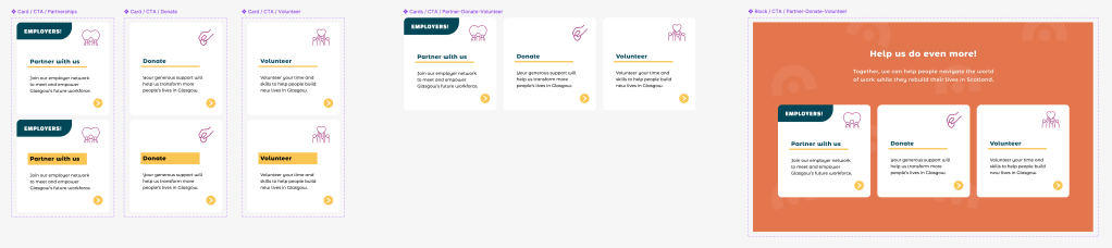
I designed a brand kit to provide guidance on how to use the new brand. I also created a pack of brand collateral, including logos, graphics for different social media platforms, and an animation to launch the new brand on social media.
Wireframing, prototyping & content
After refining a new site map with the charity, I created pen-and-paper wireframe sketches.
I used an approach from Object Orientated UX (OOUX), starting with smaller components and building up to screens, so that my designs would be accessible and intuitive.
With wireframe sketches in place, I created a content plan to identify the content for each page.
I developed this into a document for the charity to use as a reference point to help it gather existing content and write draft copy while I started to design the prototype.

I started by designing the homepage, as this would provide an engaging and accessible way to involve the charity in the design process.
While I was aware of the pros and cons of this approach, I was confident that my wireframe sketches had given me a clear sense of the overall structure, the main user flows, and the design requirements for core components.
I shared the prototype with the charity from a very early stage, and throughout the prototyping phase, so they could provide feedback as I developed the designs iteratively in response to user testing.
User testing
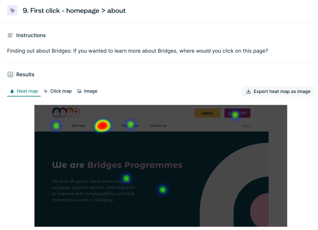
As I was volunteering on the project in the late evenings, I decided to conduct unmoderated remote user testing at various points in the design process, using the research tool Lyssna.
I gathered qualitative and quantitative data through online surveys, first click testing, preference testing, and tree testing.
I designed a longer study specifically for people who interact with Bridges Programmes:
- 15 service users
- 6 members of staff
- 3 employers
- 2 agencies who refer clients to the charity.
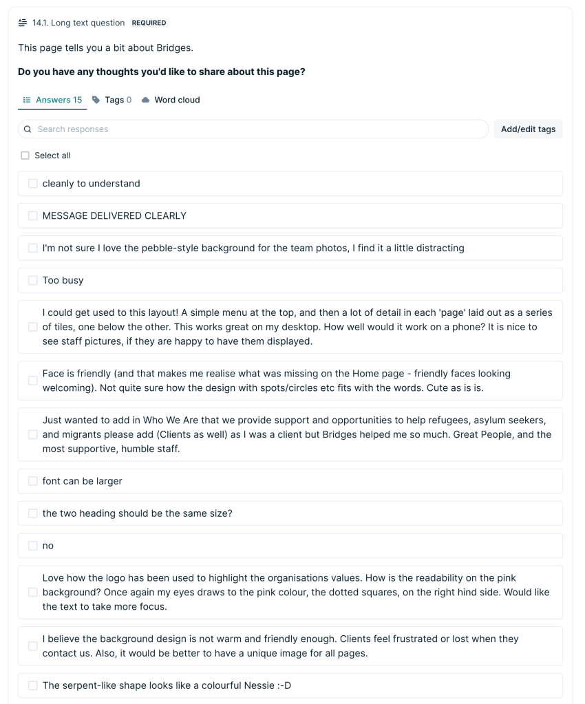
I designed more focused surveys to get feedback on specific screens and user flows from a broader audience, with a total of 44 responses from participants in Lyssna’s research panel.
I also received feedback and a design review from 5 members of the Scottish Tech Army.
I analysed the qualitative data, quantitative data, and visual data such as heatmaps, and produced a research summary for the charity.
The feedback was exceptionally helpful. I was able to see where the designs were working as planned, and where I needed to give more thought to the designs.
My research helped me to improve the visual design, accessibility, information architecture, user journeys, and content design.
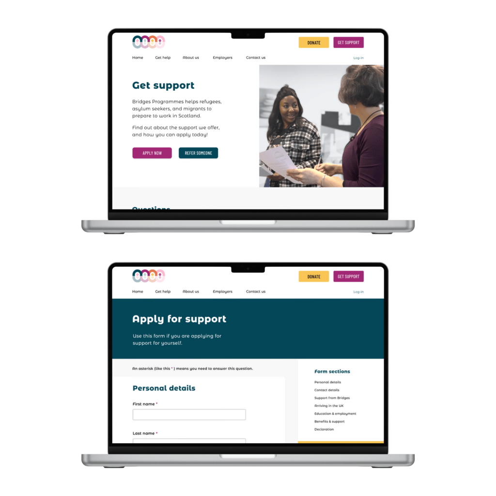
Example: “Get support” journey
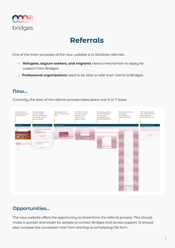
One of the more complex parts of the project was designing the user journey for refugees and asylum seekers to apply for support. This was the highest priority user journey on the website.
I mapped the existing journey, and found that it included a (difficult to find) link from the website to a Google Form, which then linked to two Microsoft Forms.
I knew, from speaking with the charity, that their users are often very wary of following external links, especially when asked to provide sensitive personal data and immigration data.
The application forms were very long, and included technical language, abbreviations, and ambiguous language. This made it likely that many users would not complete the form.
I proposed that we create a “get support” journey for people to easily find information and apply for support without having to leave the website.
This would be more secure and trustworthy, and it would embed the application form within a broader journey in which the user has access to information and support, and feels safe and reassured that their data is secure.
It would also provide the opportunity for the charity to use data analytics tools to monitor user behaviour and conversion rates to facilitate continuous improvement.
Through user testing, and in conversation with the charity, I considered what information people need, and expect to see, before they make an application for support.
I noticed that the journey could have many different starting points, from many different places on the website, and I considered how best to signpost users towards where they need to be.

I designed a “Get support” page, which includes questions about the type of support the charity provides, who is eligible for support, the application process, and how to get help with applying.

I included multiple routes to the “Get support” page, including a prominent “Get support” button in the top navigation, and components on relevant pages throughout the site to guide the user.
The “Get support” page would clearly direct users to either the application form, or the referral form (for agencies who refer clients to the charity).

I designed the application and referral web forms to be accessible, inclusive, informative, and supportive. There is a sticky menu for users to see what information they will be asked, to easily jump to different parts of the form, and to contact the charity if they encounter any issues when trying to apply.
I worked with the charity to reduce the number of form fields from 29 to 16, and so to reduce the drop-off rate; the removed fields would be explored during the charity’s first meeting with the user post-application.
I designed the forms to include logic, so that the forms do not ask for irrelevant information, and so making it quicker and easier for people to apply for support.
Originally, I had planned for the application forms to be multi-stage forms, to reduce cognitive overload and improve accessibility. However, after reviewing comparator sites, I considered that a single screen form might be important for transparency, given the nature of the data being captured.
This is something that could be monitored and explored further once the website is live, to determine whether a multi-stage form or a single screen form would better meet user needs.
Final design and handoff
A new CEO joined the charity towards the end of the project. At this time, the charity decided to cut short the project and employ an agency to build the website more quickly, based on my designs.
Unfortunately, the agency that built the website changed my designs substantially, resulting in a less visually appealing website that no longer meets all WCAG accessibility requirements (especially on mobile).
This was extremely disappointing. But I learnt a lot about the importance of accessibility, attention to detail, and not rushing work to deliver products. I learnt that, even with good brand guidelines, and clear designs on Figma, after handover those designs can be changed by developers.